Best Practice 1.7 – Provide sufficient colour contrast (Baseline level)
Choose appropriate colour combination between visual presentation elements to its background colours so that they have a proper contrast ratio, at least:
- 4.5:1 for text
- 3:1 for interactive elements, or graphic objects (that deliver information to user)
with its background to make the content easy to read.
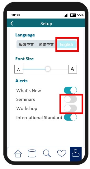
Scenario 1
| Before Rectification | After Rectification |
|---|---|
 |
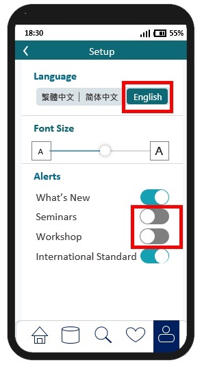 |
| In this example, the button text “English” and the toggle switches in “Off” state (i.e. alerts for Seminars and Workshop) have poor contrast with the background, making it hard to read. | When higher contrast text is used, the button text and the toggle switches are much easier to read. There are colour contrast checkers available online that can assist mobile application developers to perform colour contrast test. |
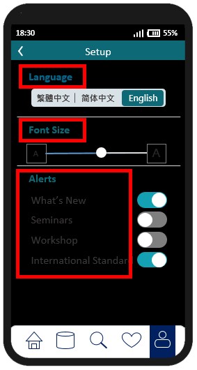
Scenario 2
| Before Rectification | After Rectification |
|---|---|
 |
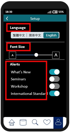 |
| When dark mode is enabled, the title texts, button texts does not have sufficient contrast with the background, making it hard to read. | After rectification, the title texts and the button text could be easy for user to read. |
W3C WCAG Reference: 1.4.3 Contrast (Minimum), 1.4.11 Non-Text Contrast


